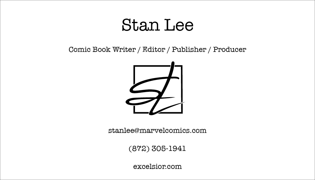
The Monogram assignment for my Typography II class was an opportunity for us to create a monogram that would later be used for a business card. We were tasked with choosing a celebrity that had passed away and creating a monogram based on them. Whether it was in the name itself, their personality, or even their style, this was a way to work with both type and layout. The person I chose was Stan Lee,
who passed away on November 12, 2018. He needs no introduction but what drove me to this decision was my love of comic books, the stories, the characters, and of course, the movies that were produced from these stories.
who passed away on November 12, 2018. He needs no introduction but what drove me to this decision was my love of comic books, the stories, the characters, and of course, the movies that were produced from these stories.
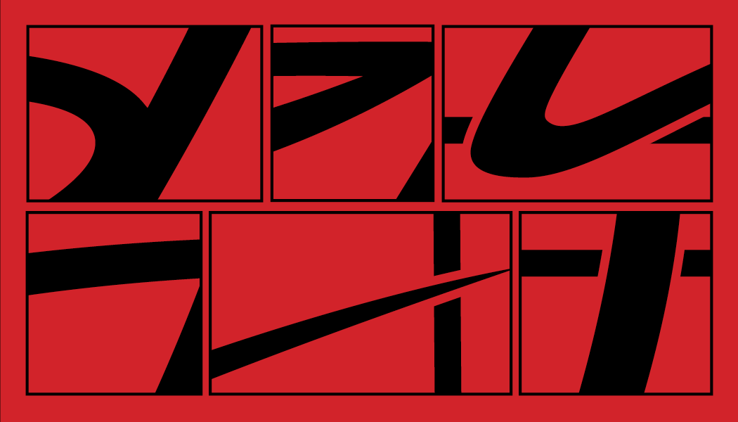
I started first by making thumbnails sketches of my monogram. What I tried to incorporate was how Stan Lee would do his signature. How would it look in a monogram format and how to apply it on a business card. As I furthered my iteration, what I wanted to convey with my monogram was a nod to his signature as well as being able to spell out this entire name within the monogram. I also wanted to box it in a square shape to also pay homage to the work he did in the comic book world. For the business card iterations, I did multiple takes on what it could look like. In the end, I went with a type that closely resembles what typewriting looked like back then. And with the back of the card, I was influenced not just by comic books, but also manga. I feel like having those moments enlarged in those panels really gives the viewer a chance to take in the form and movement of the monogram.