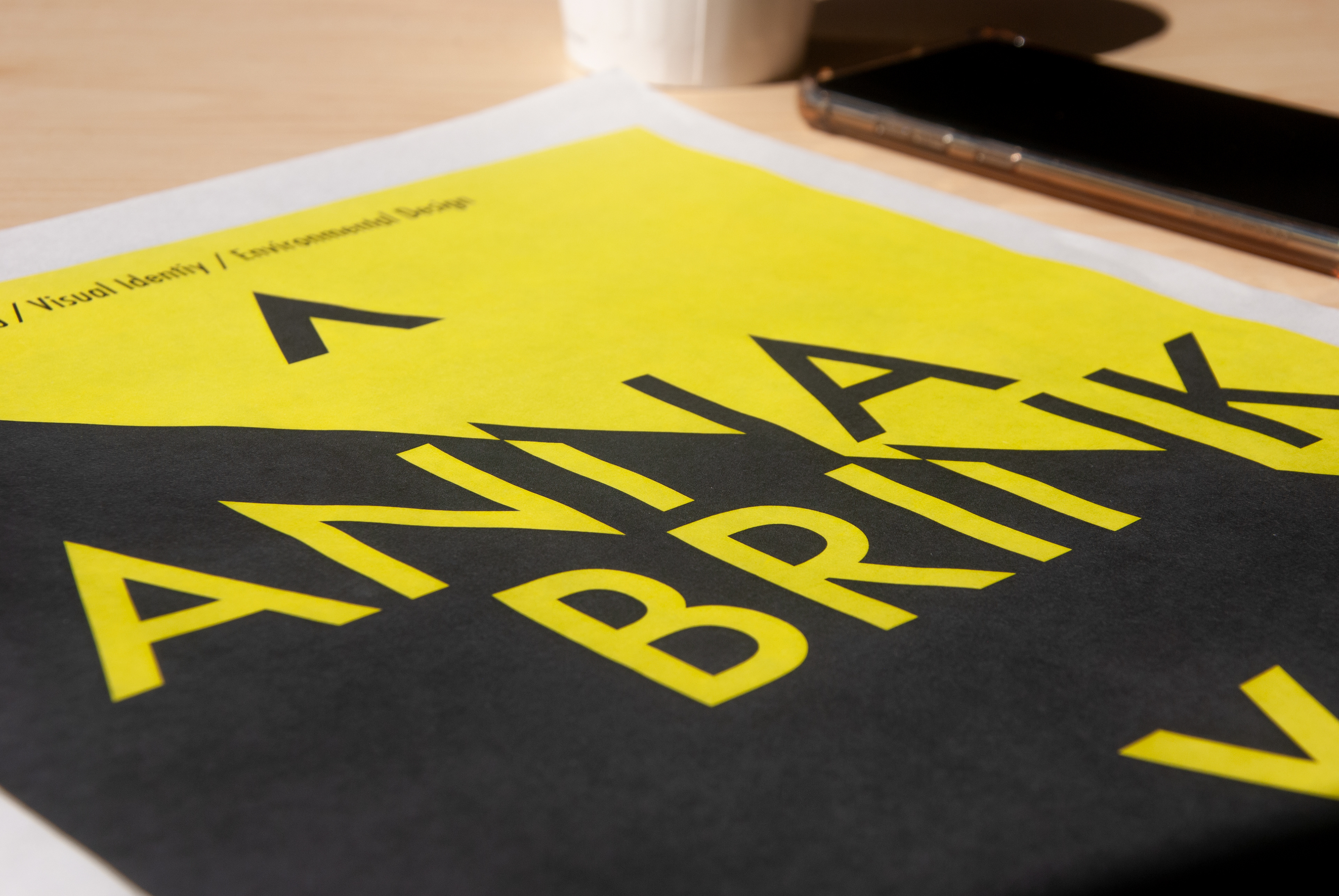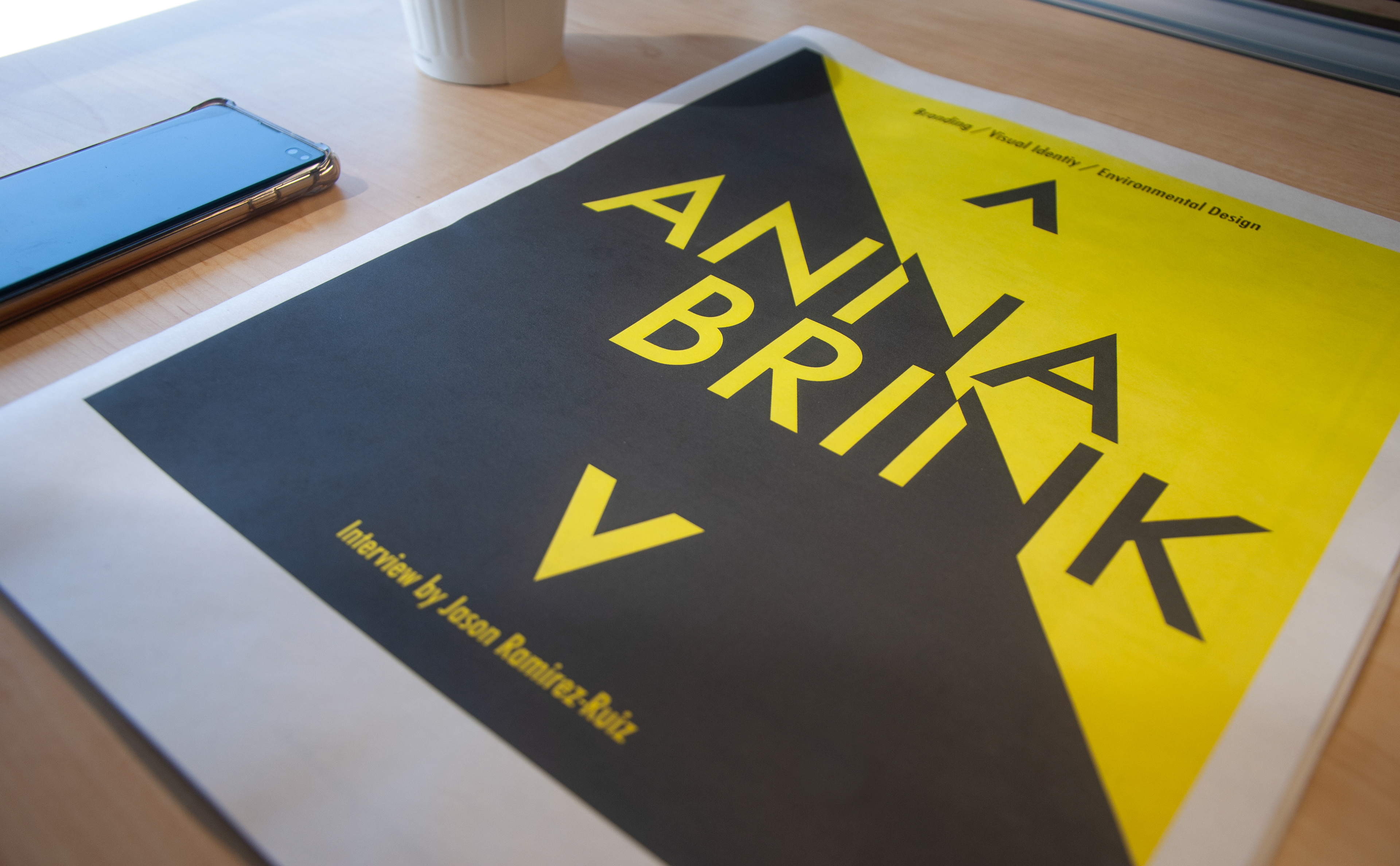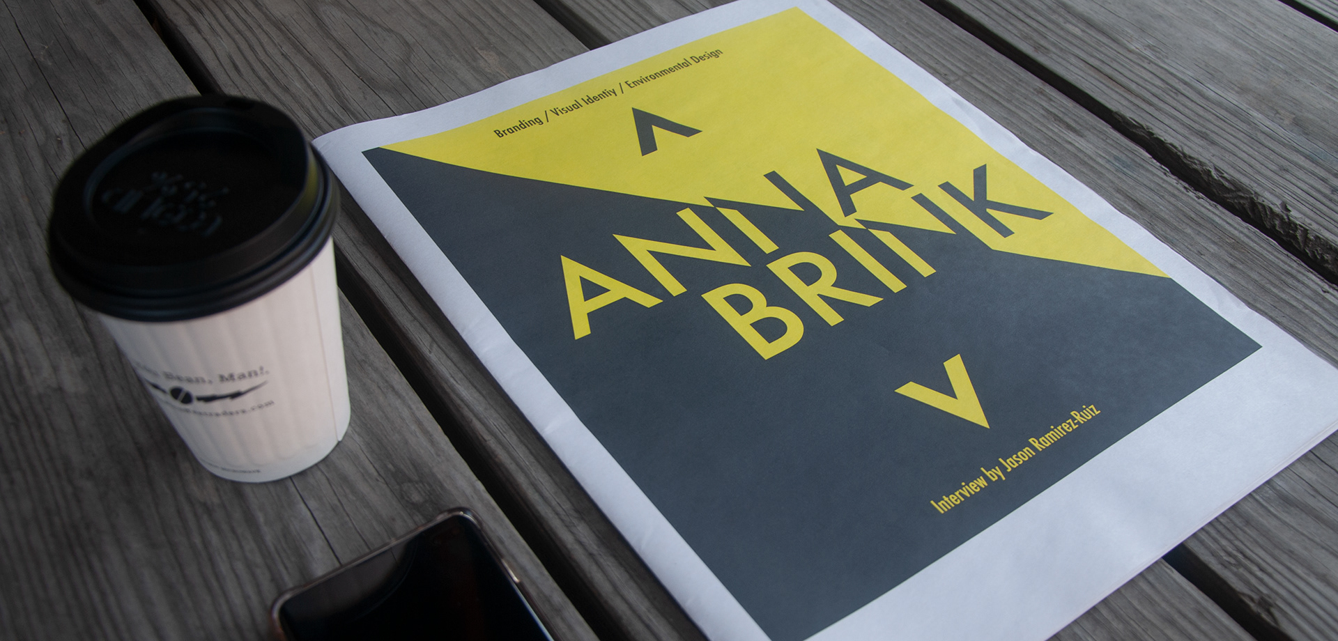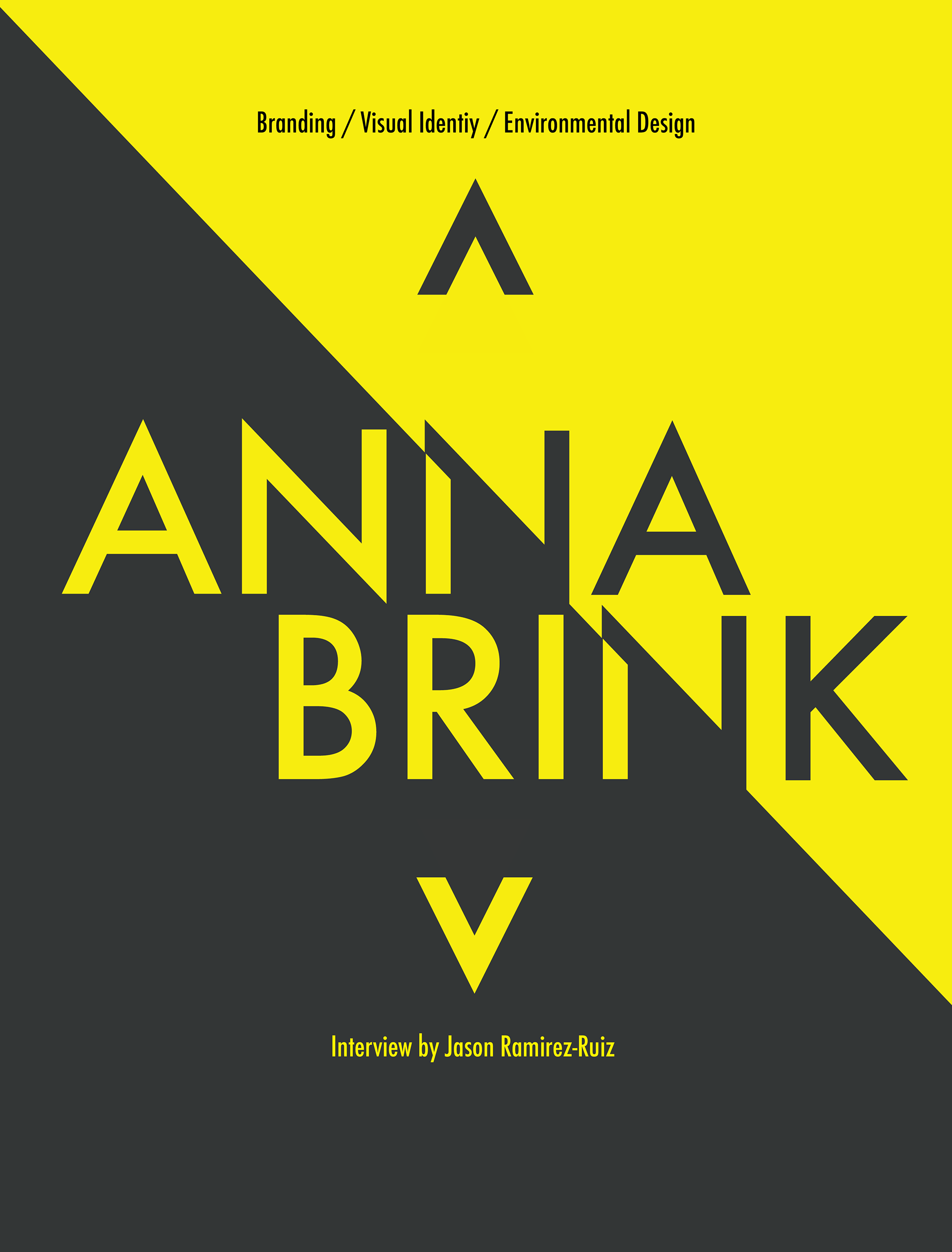
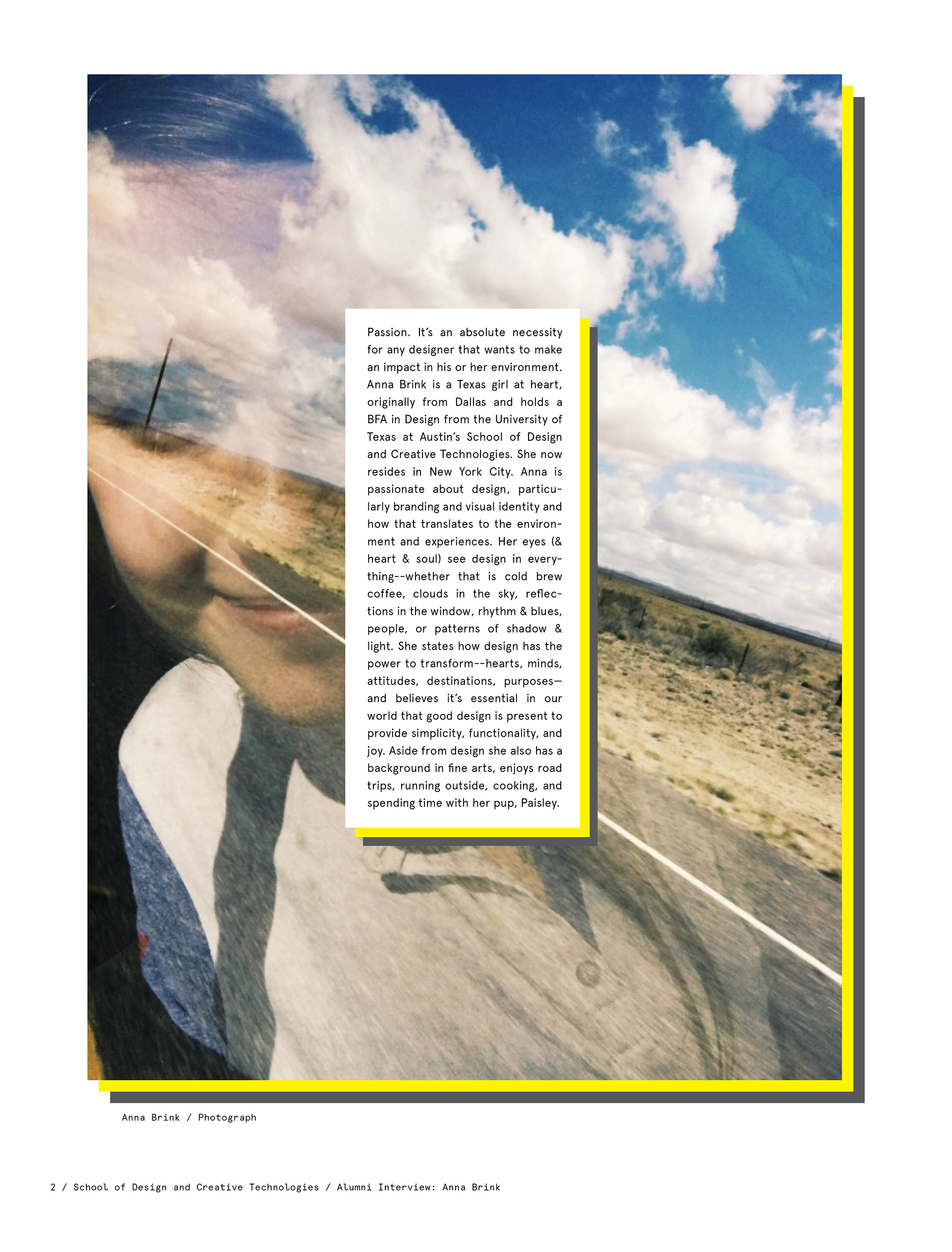
One my of design classes, Typography I, we were assigned to do an Alumni Interview. Probably one of my
favorite assignments across the UT design classes we were tasked to come up with a list of questions as a class for our alumni to answer. The alumni I received to interview was Anna Brink. The way I approached this project was to see what I could come up from the visual letterforms that came from the name ‘Anna
Brink.’ What I like to do with my design thinking sometimes is that I reduce shapes, or in this case the type, to their basic forms, angles, and quirks. This way, the type, becomes more efficient for me to work with.
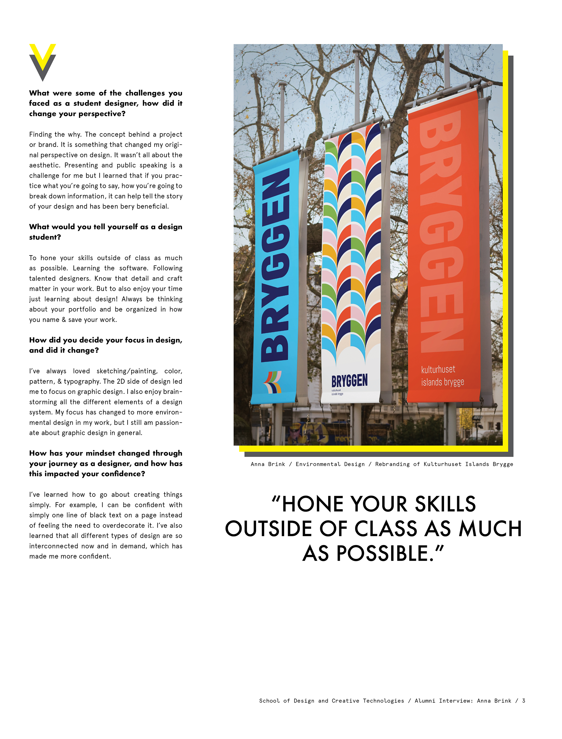
One of the things I like to do is highlight what’s most important. I believe it’s a crucial part of the design,
and more importantly, design communication. It’s almost like you have to respect the work that you put in
as well as the work of somebody else that you are representing within your own work. The alumni interview was a very cool project for me because it allowed me to play with type, layout, structure, and color. Even after having a physical copy of this work, in newsprint, it’s always important to remember that any digital work that can be manifested into a physical form. It was also an important lesson on how a physical product can look great for process and documentation.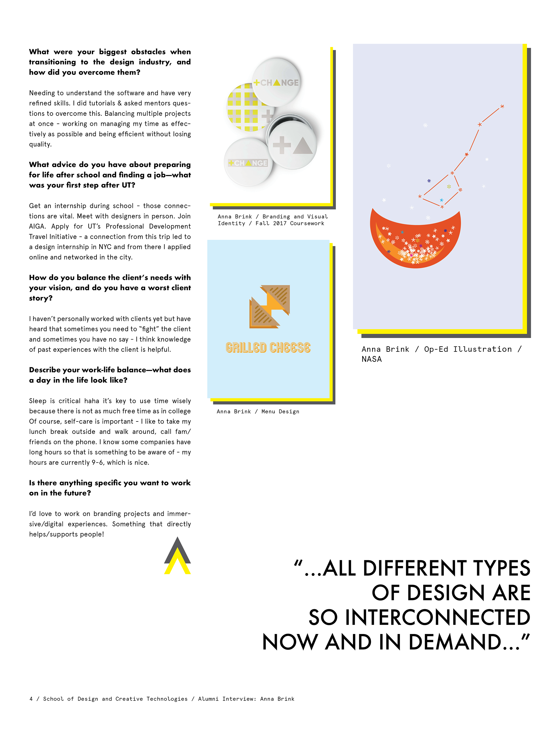